If you look closely enough, you’ll notice that every neighbourhood has its own unique colour palette, which helps define its character. Some are strictly uniform and monochromatic, while others are a wildly chaotic patchwork of distinct colours. Many of these shades and swatches stem from the materials used in a neighbourhood’s construction throughout the years. These material sources, over time, create a palimpsest which speaks to the local history.
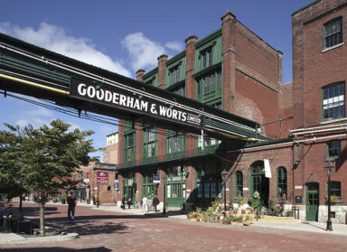
121 Scollard Street, in Toronto, is a brick building within the Yorkville-Hazelton Heritage Conservation District (HCD), which means there are restrictions and stipulations surrounding what can be done with it. ERA was engaged to ensure the revitalization of the property met the heritage considerations of the neighbourhood.
“The building was vacant and in relatively poor condition when ERA was brought on to the project,” says Project Manager Emily Collins. “The first step ERA took with the owner was to obtain heritage approval for a restoration scope, including extensive brick remediation. Following this, ERA worked closely with the owners to review and provide input on all exterior alterations proposed to accommodate the new tenant.”
“The work reviewed by ERA included alterations to entrances, windows, the new rear and third storey addition, tinting of exterior brick, and exterior lighting. ERA’s approach was to ensure all work was done in a sensitive manner to the existing building.”
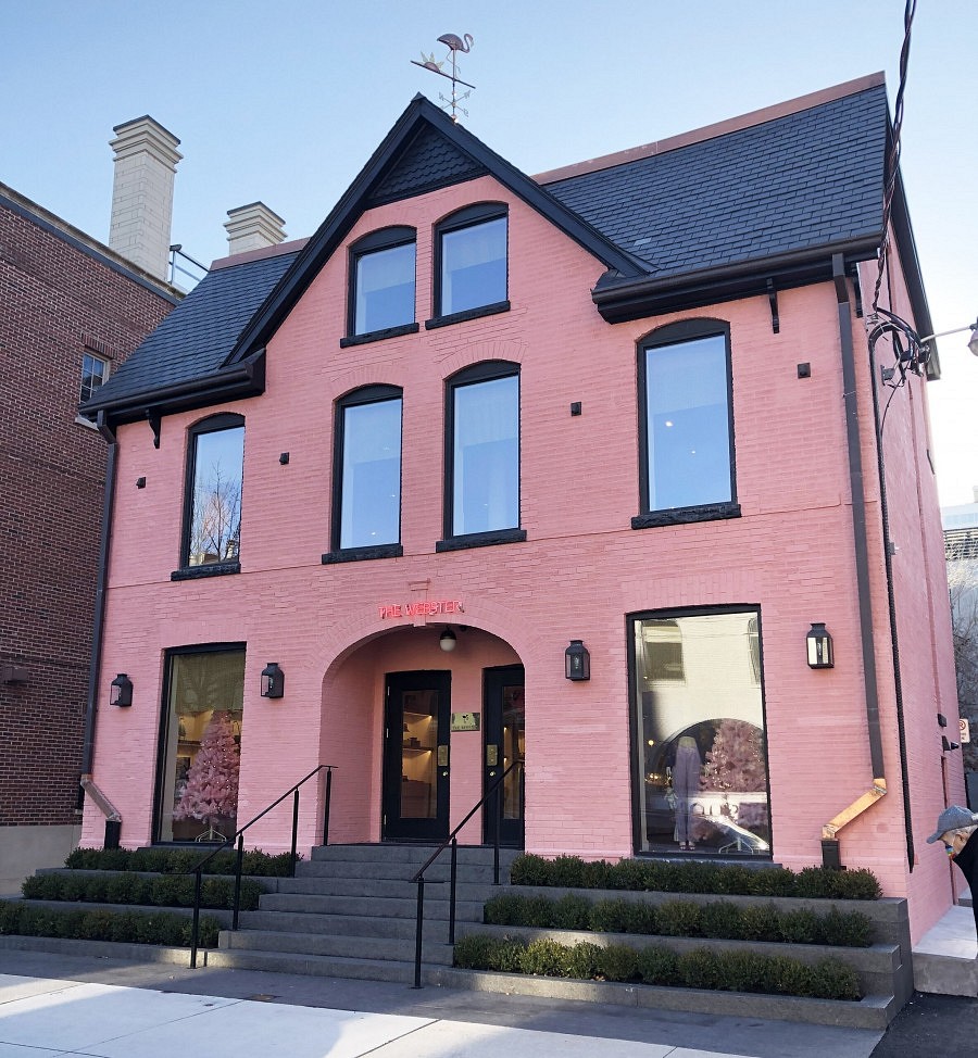
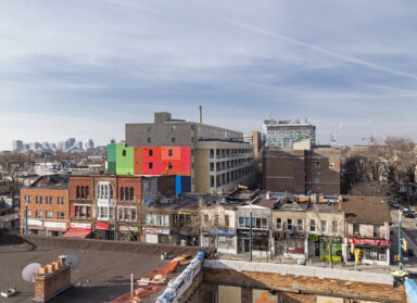
The new tenant is The Webster, a Miami-based chain which, inspired by the local waterfowl there, paints their stores a hot flamingo pink. Given the new store’s location in an HCD, that particular shade was not going to be permitted, so a happy medium in line with the local character had to be arrived upon and approved.
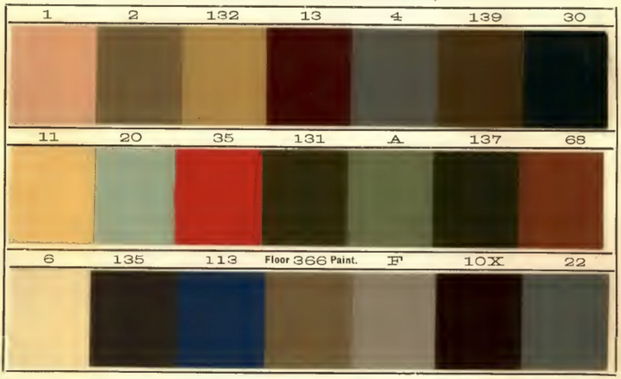
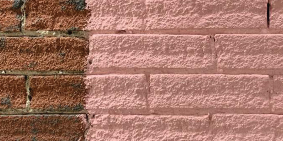
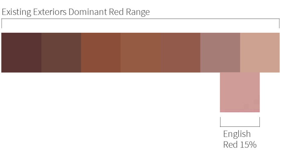
There is precedent within the District for painted brick, but the HCD guidelines stipulate “paint colour should rely on historic and District precedence for inspiration and guidance.” ERA pulled historic colour chits from the 1890s to use as that inspiration, and arrived upon English Red 15% as the ideal colour for 121 Scollard.
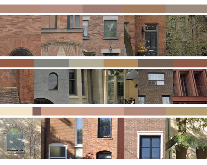
From there, the job became proving that colour fit within the local heritage of the District. To demonstrate this Carl Shura, ERA graphic designer, took a walk.
“The core argument was the colour needed to have precedent in the neighbourhood,” Carl says. “So I went out and walked those few blocks, taking photos at every stop along the way. I also pulled up Google Street View, just to check in on the colours in the last couple of seasons. It was from that point an exercise of colour matching and putting a swatch together.”
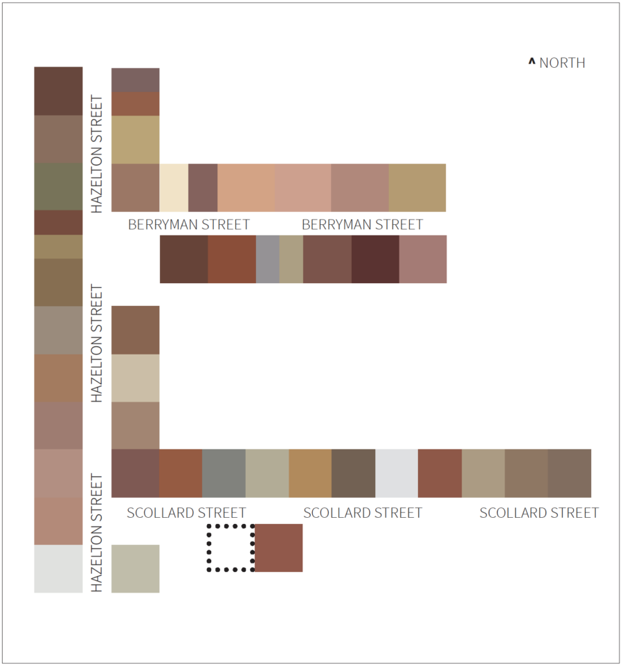
The buildings Carl photographed varied in colour: earth tones, dark greys, burnt orange, green, and many shades of red. He turned his photographs into swatches, laid the swatches (representing the various buildings) into a map of the neighbourhood, then demonstrated how English Red 15% fit in a linear gradient of existing neighbourhood red swatches. All of this was included in the “Exterior Colour Study of the Yorkville-Hazelton HCD,” included in the report to receive permission to use this particular colour within the District.

“Most HCDs are pretty conservative in their limitations and parameters. But, with reference to the existing precedents of colours in use in the neighbourhood, we could show that there is a diverse range of colours here.”
It was an interesting experiment, and a persuasive demonstration. Carl says he simply used an approach that’s common in his graphic design work—using colour gradients to present design possibilities—and turned it into a mapping exercise, pulling elements from the existing, physical world.
“I liked it because it does produce a very clear visual of these thumbnailed colours on the streetscape. When appropriate, we plan to use this approach a lot more often,” Carl says.
The result is something that stands out as a design choice, without sticking out like a sore thumb within the context of the rest of the neighbourhood. The tenant got to retain their brand identity, and the Yorkville-Hazelton Heritage Conservation District was satisfied it retained its historical character.